Saturday, 13 February 2021

Creating Contact me on Wix

Hi,

In this blog, I will be posting the process of me creating the Contact me page on Wix.

If you haven't looked at my previous blog posts you should definitely do that, that way you will be able to understand the process better!

WIX


I started with adding a page and renamed it to 'Contact'.

///
Then I chose a template by clicking on 'Add > Strip > Contact'.

///
Once I had the template I started to change the background and text as wished.

///
Again I used the font 'Lulo clean' to make it fits with the header.

///
As an email, I added my school email and used the font 'Libre Baskerville' to make it easy to read yet big enough to see.

///
I also added a text by clicking on 'Add > Text > Paragraphs'. The text I added was ''Got any question? Do not hesitate to contact me!'' This way people will easily ask any questions without hesitating.

///
As the last step, I added the menu bar by clicking on 'Add > Menu > My menus'.

///
Once I adjusted everything as wished it looked like this.

///

FINAL RESULT
CONTACT ME


This is the final result of my Contact me page, I used the font that I had used on my previous pages, and the colors that are easy to read and also are the same as the other pages. Once again everything is easy to find such as the menu bar on the top left corner. And by adding the text ''Got any questions? do not hesitate to contact me!''  it will make people help with contacting me rather than hesitating if they should or not.


WEBSITE


Creating About me on Wix

 Hi,

In this blog, I will be posting the process of my 'About me' page on Wix that I am creating for my online portfolio.

In my previous blog, I posted the process of creating my homepage, If you haven't looked at that one I would recommend you to take a look at that post first so that you can be up to date with what I am doing.


WIX 


Firstly, I clicked on 'Site menu' and then '+Add page' by doing that I could add a page which is in this case the About page.

///
So, I added a page and changed the name to 'about'.

///
Then I added an about-template by clicking on 'Add > Strip > About'.

///
After choosing a template I started to adjust the texts, color, and image.

///
I changed the background color to white so that it fits with my homepage.

///
Then changed the text and font, I once again used 'Lulo clean' as the font to make it the same with the header. 

///
I then changed the text and used the font 'Futura light' to make it easy for the reader.

///
After the text was done I changed the image by clicking on 'change column background'.

///
I once again used "Add > Menu > Horizontal menus' to add the menu bar.

///


FINAL RESULT
ABOUT


This is the final result of my About page, for the image I used an image that fits perfectly with the one on the homepage, and once again it attracts the reader by color. And the text is short but enough that makes the reader want to read it. Once again the menu bar is easy to find on the left side and also pops out because of the image being dark in the background.

///

WEBSITE


Creating homepage on Wix

Hi,

In this blog, I will be showing the process of creating my homepage on Wix.

Wix is a software company that allows you to create an online website by using the tools.  

I will be using Wix to create my 'online portfolio' for my Digital arts course.

WIX


After registering you get asked what you want to create in my case it is the one on the right side that says; Create your website with the editor.

///
Then I could either choose between a template that already exists or create one.

///
I chose ''Blank templates'' and then ''Start from scratch''.

///

 
Once I clicked on ''start from scratch'' this is how it looked.

///
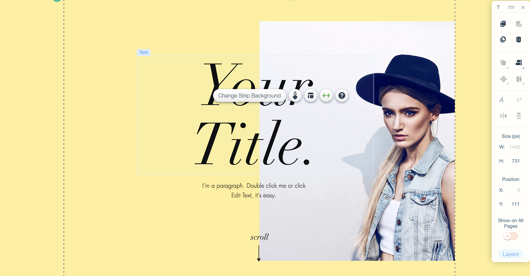
I added text for my header by using 'Add' and then chose the wished size and font.

///
I chose the font 'Lulo clean' the reason I got inspired to do this font is that when I was doing my website research I got inspired by the 'DAZED' website where they also use the big all-caps font on the text.

///
Then I added a Welcome strip by clicking on 'Add > Strip > Welcome'.

///
Then I chose a template that I could work on and adjust the color and text.

///
I gave the background a white color.

///
And edited the text as wished.

///
I then changed the image by clicking on 'change image'.

///
Then I chose '+upload media' and added a picture.

Then added a menu bar by using 'Add > Menu > Vertical menus'.

///

FINAL RESULT
HOMEPAGE


This is the final result of my homepage, I have chosen to use this picture because it is fashion photography which I think fits perfect to my portfolio and it may be attention attractive because of the pose and colors. I got the inspiration of using an image that attracts attention from the Harpers Bazaar website while doing my research on websites. This is going to make people interested in my work and they are going to want to see more. I have chosen a blank background because I want the attention to go to the work that I will be posting and this will also make it easier for people to find the right information. People tend to look on the left side of a website for more information so that is the reason I put my menu bar on the left side. As I mentioned earlier the website 'DAZED' has inspired me to use an all-caps header. 


WEBSITE


Thursday, 11 February 2021

Website research

 Hi,

In this blog, I will be showing the research I have done on three different websites that I think can be useful while creating my own.


Vogue

The first website I visited was the British Vogue, because I will be doing an editorial I thought that this was a great website to take a look at. To see how they represent their work online. It is very easy to find an article you are interested in, on the left top corner for example; Beauty, Fashion, Art&lifestyle, Runway, News, and Video. What I also really like about this website was that you could choose the country you are from and the vogue site of that country will show up. Then it is also really easy to subscribe as it is seen on the picture it has a red color to attract attention. On the right top corner, you could find back the menu, which again makes it easier to find everything in one place. Overall I liked how this website was created, it is nice and clear also the pictures being used make it easier to support the article and attract attention. 


Site: Vogue


As I had written before, it is easy to choose the country you would like and read the articles.

Harpers Bazaar 

Harpers Bazaar is a women's fashion magazine. This is also a site that I really like because everything is easy to find and to look at. You can easily find the topic you are interested in such as; Fashion, Beauty, Culture, Sustainability, and at home. The picture on the start page makes you look twice and really attracts attention because of how huge it is placed. On the left side, you can find the menu which is in red so it is easy to find. Then on the right side, you have the subscribe button which again makes it easier for people to subscribe within the same you can find back the newsletter, search bar, and the countries you can choose from. The huge picture and the text are attention capturing which I will also use while creating my website to make it visually appealing to the audience.


These are the bars that pop-up when you click on the 'Menu-bar' and the 'countries' to choose from.

DAZED

Another website that I really like is 'DAZED' this one is more appealing to the teenagers with the set-up and style. This website uses lots of the latest trends that teenagers tend to follow. Also, the letter type they have used is more likely to be used by teenagers too. The menu bar on the top left corner might be hard to find at first, but because of the attention capturing pictures on the site, you automatically take a look there too. What I found interesting was that instead of putting the 'subscribe' button on the top they have put it a little down that you can see whenever you scroll down. And they have also made it interesting to subscribe by saying; 'stay in the know with the latest stories from AnOther'. I loved how they used caps lock within the text while writing 'AnOther'. This is definitely the site that I will be looking further in while creating my own as this is a very teenager aimed site with lots of creativity.

Site: DAZED


They also made subscribing more appealing by adding interesting pictures right beside it.


Sunday, 7 February 2021

Major project plan

Hi,

In this blog, you will be seeing the ideas and plan of my major final project.

I started off by using milanote to gather my ideas and put them together.

The audience; 


I decided who my audience would be and then considered what the budget would be on the basis of the audience. (If of course, this would be an editorial on paper.)  


Moodboard

I then made a mood board with the latest trends and corset-styles, also put the most-used colors. Now while making the editorial I can base myself on this mood board and this will also help me better during the process of making my editorial.


References 

Project Sign-off

 Hi,

In this blog, you can find my project sign-off.


Final subject decision

Corset

For my final subject, I have chosen to use corsets.

Because of my continuation route being Fashion communication and styling, I will be making an editorial.

In my editorial, I will be talking about the different types and styles a corset can be worn.
my aim is to attract attention from young-adults and to make this easier I will be adding a few pictures.

This will not only attract more attention but also make it more clear what I am saying with the style and trends.

Lucidpress

To make my editorial I will be using lucidpress, a software the tutors recommended.

Source: Lucidpress


Fashion editorials

To make the editorial as accurate as possible I will be looking at other fashion editorials and writers. Also at the stylist, how that they have styled a corset, and look for more information about corsetry.

A few references that will help me with my editorial:


FINAL RESULTS PROJECT "ANCESTRAL REVOLUTION"

 ANCESTRAL REVOLUTION 2D ANCESTRAL REVOLUTION 3D https://nisanurdmu.wixsite.com/portfolio